IDENTITY
Your logo and identity are undeniably important. We’ll help you start strong.
Our Identity 20/20 Process helps your ideal customer understand what you have to offer. While we customize the deliverables to meet your needs, here’s how the process typically progresses:- Discovery and Strategy - We work with you to determine the right direction for your logo, as well as your other design needs. This important step reveals the deep stuff about who you are as a company, where you want to go, what might be getting in your way. In other words, your brand personality.
- Concepting - Once we agree on the attributes your logo should include, we get to work on concepts that meet these focused objectives.
- Presentation - We’ll show you several concepts and then put our heads together to refine the logo.
- Delivery - Along with the final logo, we’ll deliver a style guide (1-2 pages) that provides a quick reference to elements such as colors, typefaces and uses for your logo family.
Be proud of your look and confident in sharing it. If you need a professional identity (or your current one just isn’t working for you), we can help.
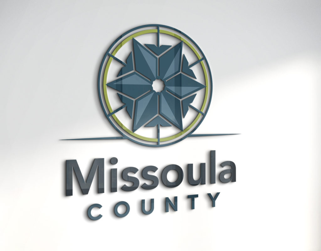
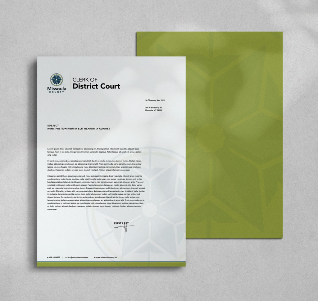
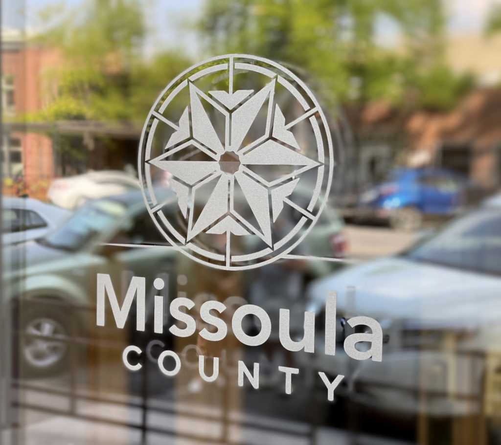
Rebrand: Missoula County
Missoula County was ready for an updated look and more clear representation of their community values.
- The new logo design was inspired by the ornate, interior dome of the Missoula County Courthouse.
- The shapes and arrows signify many facets working together toward a common goal: to serve the residents of Missoula County well.
- Colors are confident, evoke warmth, and remind us of the water and landscapes that comprise beautiful Missoula County.
Nonprofit: The Converge Foundation
Far more than spearheading a community gathering space, Converge seeks to improve lives through facilitating discovery, creativity, and in-person communion. When we’re connected and curious, we’re healthy!
-
Imperfect, diverse shapes encircle and merge around a common center eluding to inclusion, safety, and community
-
The mosaic visual approach embodies creativity in an abstract but familiar art form
-
Coloring and positioning of mosaic
“tiles” create inspiring movement -
Type is clean and professional, juxtaposing the artistry and playfulness of the mark
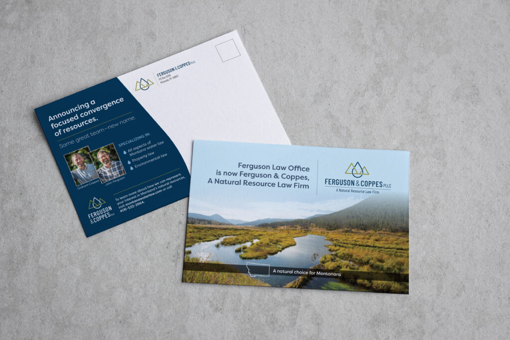
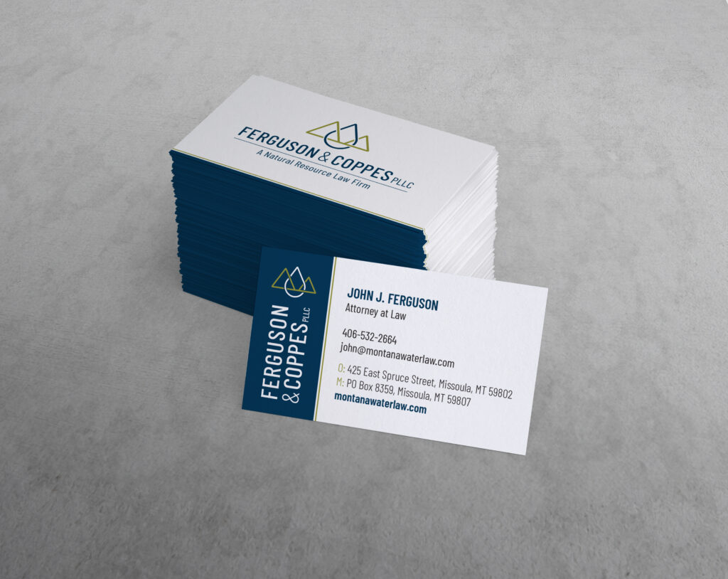
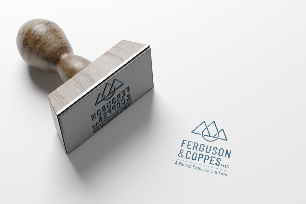
Rename/Rebrand: Ferguson & Coppes PLLC
This established firm embarked upon an exciting partnership change and, therefore, a name change from Ferguson Law Office PLLC to Ferguson & Coppes PLLC, A Natural Resource Law Firm.
- The new logo signifies interlocking water and landscape in a simple design with a nod to landowners and ranch brands—the Montana clients they serve
Meet times2studio (T2S)
Are you ready for your business to make its mark?
Brands We’re Proud to Call Partners:


