
Effective brochure design is a process that blends persuasive copy and compelling images into a message that gets readers to TAKE ACTION.
Here are some guidelines for creating compelling brochure content and design based on the panels of a standard tri- or bi-fold brochure:
COVER
This is your opportunity to offer an intriguing idea that catches your reader’s attention. Consider the problem you’re solving for your customer’s audience or the main message you want to convey.
What can you show and say here that will persuade your potential customer to turn the page and keep reading? Maybe it incites emotion. HINT: You may not even need to mention your product at all…yet.
INTRODUCTION
Build rapport with the reader. Speak to their needs and pain points first and why they can trust you to solve their problem. Then, move into the solution you’re offering and how your customer benefits from your product.
THE MEAT
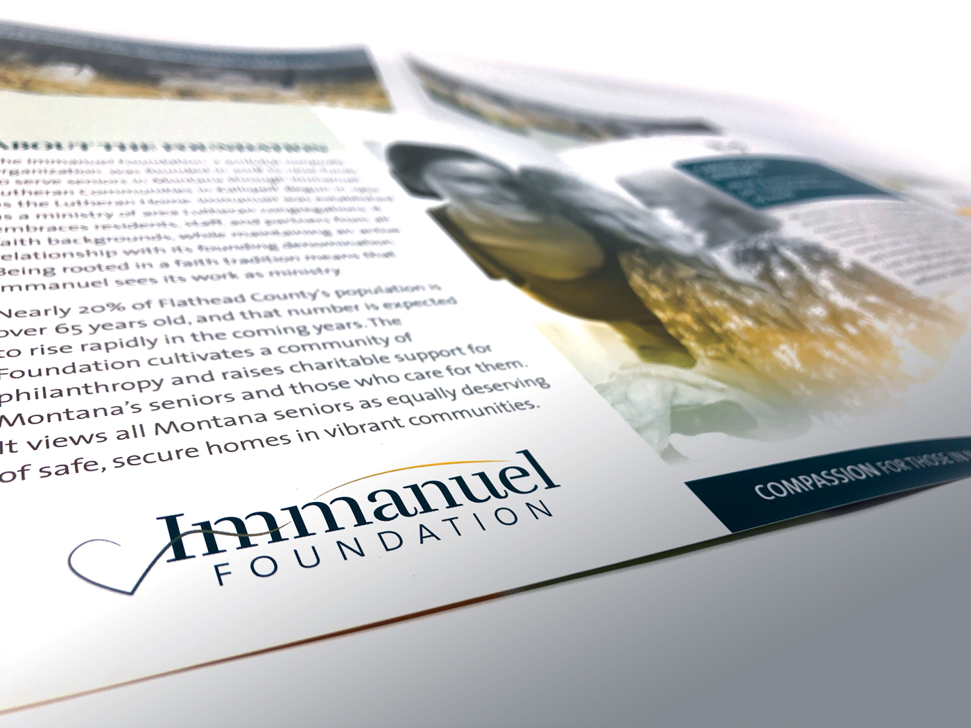
Focus on solutions and benefits first, not so much on features, details, and technical terms. When possible, site real-world examples that are relatable to your customer. Keep technical information clear, concise, free of inside jargon. For example, display data in a chart or graph when possible since this is much more interesting than reading a list of statistics. Use images and customer testimonials to establish credibility and proof.
Understand the goal of your piece. If it’s to generate leads then including detailed pricing information might be premature. If your goal is to close sales then providing pricing could be key.
SUPPORTING MATERIALS
Depending on the goals and audience for your brochure, it may be a good idea to include insert sheets, pocket folders or business card slits. You may also decide that an emailable or downloadable version of your brochure is a good idea. Consider the format of your brochure; would it make sense to reformat it to an alternate page size for a more friendly-reading e-version?
END STRONG
Provide a clear next step (call-to-action). Consider where this brochure fits into your sales process and what the next step is in that process. Should your customer call you for a consultation? Visit a website for more information? Make sure the next step is obvious.
CONTACT INFORMATION
A way to contact you is always important to include but can be discreet on a back panel (people know where to find this). The back panel is also a good place to include any necessary legalese, disclaimers, content sources or image credits.
HOW MUCH TEXT? HOW MANY IMAGES?
Too much and it looks cluttered. Too little and there isn’t enough information conveyed. Quite often, we write much more copy than can realistically be used. Read on for some general content guidelines.
The right amount of content to include in a brochure depends on a number of factors, the most restrictive one being the size of the brochure. For this discussion, we’re focusing on tri-fold brochures since they are a common format.
Content & Word Count Recommendations*
(listed in order of presentation to the reader)
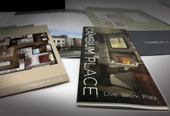
1) FRONT COVER: Could be a headline with subhead, or a short statement. A bold, large image works well here. Think succinct and attention-getting. Word count suggestion: 5-15 words
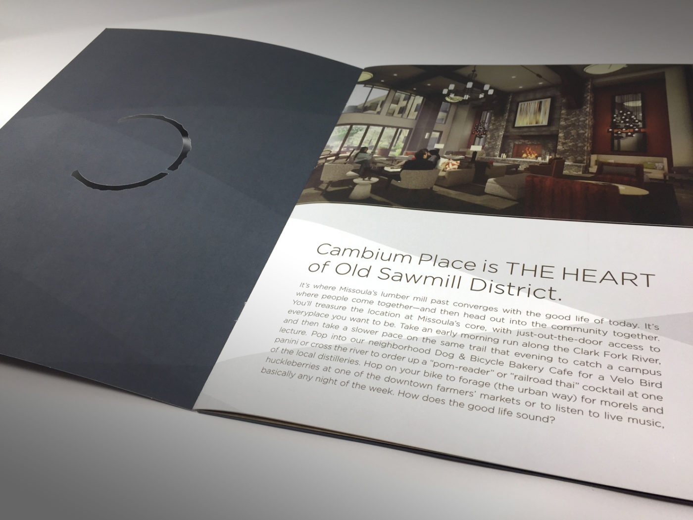
2) INSIDE FLAP: This is the second panel your reader will see. Use this space as a “pay-off” to a teaser or headline from the front cover (finish or expand upon the idea presented on the front). Or, use it to continue to engage and build rapport with your customer. A strong image or block of color is usually effective here. Word count suggestion: 10-50 words
3, 4, 5) INSIDE PANELS: Consider using this space as a full-page “spread” with an overarching headline or introductory paragraph and supporting information broken up in columns across the three panels. End with a clear call-to-action. Think about how the folds of the brochure will divide your information and try to avoid unfortunate folds such as in the middle of a person’s face. Word count suggestion: 250-350 words total (≤350 if there are minimal images and graphics)
6) BACK PANEL: Typically includes logo, contact information, possibly a repeated call-to-action, and any necessary “fine-print”.
Word count suggestion: 20-40 words
* These are general guidelines only. Always consider your audience and product when developing content. In some cases, more visuals are effective in educating readers about your product. Other times, more emphasis on text (like benefits and testimonials) makes sense.
Are you developing a brochure? Download our free Brochure Design Roadmap for even more tips and brochure examples that you can apply to your project.
(Entering your information will subscribe you to our list.)